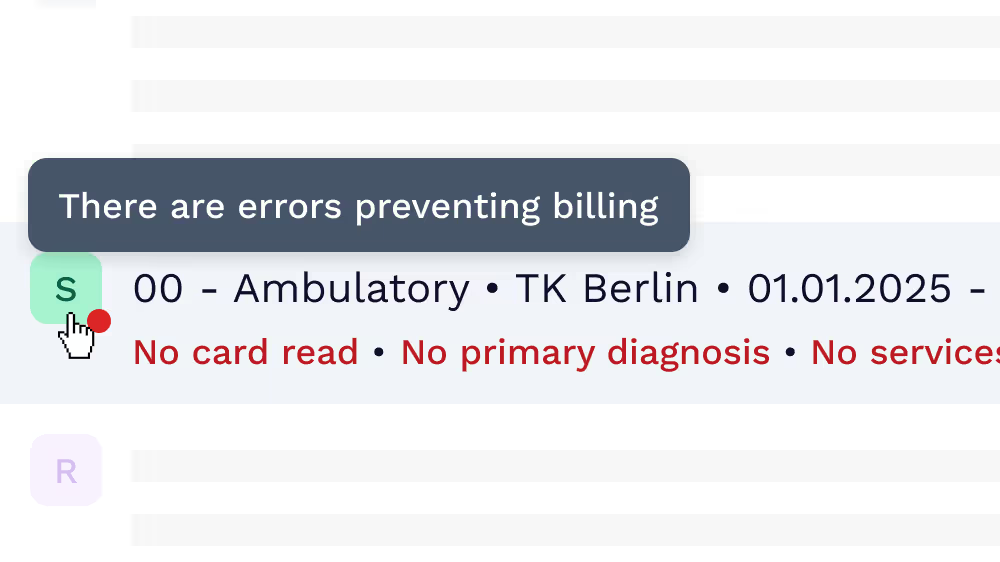
Warnings when critical information is missing
This allows users to identify when information that is billing critical is missing. Without such information, doctors are not able to bill insurance companies in Germany for the services they provide. These warnings make it much clearer to understand when something has gone wrong.

Less vertical space
We were able to decrease the height of entries by about 30%, meaning much more entries could be shown in the viewport and it was easier for doctors to get an overview of patients. We did this by removing redundant UI elements, space between elements and the collapse interaction that shifted the interface.

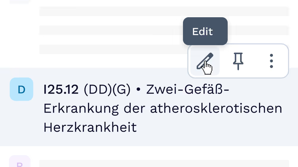
Common actions on hover
Common actions are shown when hovering over elements. Even less used options are hidden under ellipsis. This was categorised by data we had previously collected about user behaviour.
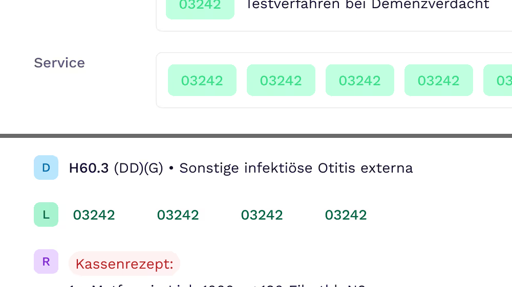
Unique UI elements to illustrate different entry types
Clear identifying UI elements for each type of entry that will appear in a patient’s file. These can be reused everywhere in the application.


